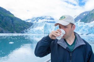
This past month I’ve been on the road more than usual. I went on a honeymoon in Alaska and as soon as my wife and I got back from the trip we traveled in-state to another wedding.
We both work from home offices so being on the road is a little different for us. We like it when we have the chance to get out and see new things. Driving can be an inspiration including the idea for this post.
When it comes to online marketing, titles and headlines might be one of the most or perhaps even the most important thing. If you can’t get somebody past your headline then they won’t read or watch your content.
Think about that – even if you’ve written a great blog post or created a great video or infographic, a person might not watch it simply because your headline or title was no good.
Here is a little tip I picked up along the road that can help you create better headlines.
The Billboard Formula
During our trip, my wife and I passed many billboards. There weren’t that many in Alaska, but we did see them on occasion especially when driving into the populated areas. Even if they weren’t technically billboards you could see signs and what they were advertising or promoting.
Back in Wisconsin, there are many billboards along the main highways especially as you near the major exits for cities and towns.
As you would expect, there were good billboards and there were bad ones. The good ones made me think twice about taking action or at least put the idea of something in my brain that might pop up later when I had a particular desire.
The bad ones didn’t do that. The only reason I noticed them at all was because I was thinking about this post. And I’m sure I missed many of the billboards because they didn’t stand out as important.
That’s exactly how headlines and titles work in the online world.
Here are a few lessons learned from the billboard world that apply when you’re creating titles.
1. Shorter Is Better
There were a couple ridiculous billboards out on the road. I’m talking about things that would take 10 seconds to read. Obviously when you’re cruising along at 65+ MPH you’re not going to have time to read that much.
The best billboards were short and to the point while still being effective. This is not easy. If it were we would all do it with our headlines.
I’m not a huge fan of fast food, but the fast food companies like McDonald’s, Starbucks and Burger King were good with this point.
You’ll see headlines like:
- 100% Beef
- Don’t Eat The Billboard
- Better Coffee. Faster.
- Skip The Office Coffee
- Whopper Lust
When you use the right words and keep it short, people will get it and they’ll be enticed.
Take out words whenever you can. See how short you can get while still being enticing and descriptive. It’s an art and it takes practice. It’s definitely not easy, but you can get inspiration from billboards.
2. The Right Image Can Close The Deal
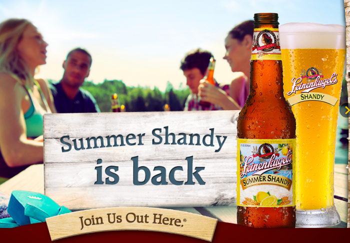
There is a Wisconsin company called Leinenkugel’s (Yum). They invest heavily in billboard advertising. They stick with short headlines and they do a great job with images. They’ll put up an image of a summer Wisconsin evening on the lake. There might be a beautiful dock overlooking a sunset.
The headline will read, “Join Us Out Here”. It’s short and simple, but it sells an experience. Every time I see their billboards I want a Sunset Wheat beer and I want one on that dock or patio or whatever the setting is.
Images are easier to share on social media sites and even a little bit on search engines today. The image you share is just as important as the title in some cases just as is the case with billboards.
Video snapshots are important too. I saw a good one recently for a music video that had the title repeated on the snapshot. It stood out.
3. Action
The final thing I noticed was the call to action. Not all billboards had them. Not all headlines need them, but most of the time you want to make sure your audience knows that its supposed to do something.
Think of the gas station or hotel billboard that is coming up at the next exit. They’re not only trying to get in your head. They’re trying to get you to pull over. Some fast food billboards are for branding, but some want you to take action.
The best billboards keep the action simple. They might show their logo, like the Motel 6 logo, with big letters that say, “Exit 134”.
Simple, but descriptive and it makes you know that you should exit.
Conclusion
It might not seem fair that people won’t look at your content if you don’t have a great headline. But life isn’t fair. It’s hard to win if you don’t have a pretty face and in the online world, a headline is a face and you almost always need a good one in order to win.
The good news is that you can make your headlines better over time. And there is inspiration everywhere. One example is The Billboard Formula. You don’t have to do all kinds of crazy testing to get better headlines. Piggyback on brands that invest millions in testing. Look at their billboards and follow the same formula.
You’ll get better headlines, more traffic and more clients.

