I like to test.
When it comes to blogging I think it’s important to test a variety of things including:
- Design
- Post Type (video, text, podcast, etc.)
- Topic
- Etc.
There are countless things you can (and should) test on your blog. Even if you start out with a solid blog strategy (good idea), a part of the strategy should be to allow the writers some leeway to experiment and try different things. And trying different things on the blog should also include changing up aspects of the design.
Blog Design Experiment – The Top Navigation Effect
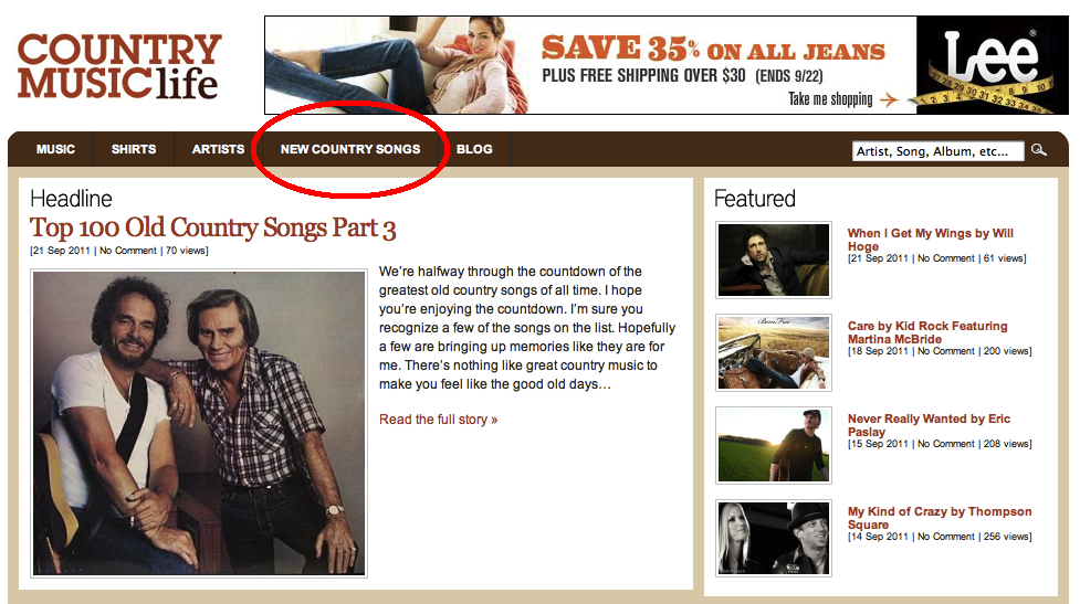
Just last week I tried something on my site – Country Music Life.
I wanted to experiment with adding a new link to the top navigation. The focus on the site is to give country music fans a place to discover new country songs and albums. So I figured it would be a good idea to put some emphasis on the page.
So I moved it from the sidebar to the top navigation.
A change did happen. The graph is a little misleading, though, I think. There appears to be a huge increase the week of the change, but there were a few weeks back there that had some good traffic.
The results show an average of 186.5 visits per week for 11 weeks prior to the change. After the change the next week there were 250 visits to the page. That’s a 34% increase in traffic to the page. On a large scale that’s quite a bit. And all because I moved a link from the sidebar to the top navigation.
I figured there would be a traffic increase. And that was the plan. I want people to find their way to the New Country Songs page so they can discover new country songs and albums they may have not heard yet. Or they can find songs they have heard, but want to learn more about and hear again.
Anyway, back to the experiment.
It was a simple test, but the results were interesting. I’m not sure if the results are convincing just yet. I think I’ll have to let it play out a bit longer to see if the results stick. My hunch is readers get comfortable with new design and eventually lose track of the content they don’t use as regularly. But then again, the readers on CML are usually new visitors so there could be soe staying power to this trend.
Either way, I gave it a whirl and I’ll probably leave the link in the top nav for a while to see how things play out.
The Moral of the Story
This was a small test, but it was a test and there were results. It’s easy to make assumptions with blogging. It’s easy to think you know what people want to read and how they want to consume your media.
The best thing you can do, though, is to take those assumptions and test them. Think of any crazy idea you have and try it out with your readers. See how they actually respond.
Your test can be something as simple as adding a new link to your top navigation. You could even take away some links from the top navigation to see if it makes the other links more appealing.
You could even make things a little more difficult and test more elaborate design changes. Although I don’t like this approach necessarily. I like when sites continuously make small changes over time, but that’s for another post.
The moral of this post is to test.
Create assumptions and test them. And analyze the results so you know how to make your next move.


