
Let’s keep this one simple.
Your website is your online salesperson.
A good salesperson knows that too much information overwhelms a prospect.
Your website doesn’t know that. It does what you tell it to. And over time there’s a tendency to clutter things up. To overcomplicate things.
You can say what you want about Google. They don’t get everything right. But something I admire greatly is their ability to simplify things.
Not too much clutter.
Their homepage is crazy. Just a search bar and two buttons. Maybe a doodle. Maybe a blue link. They could even get rid of one of the buttons.
Let’s assume that your website has gotten a little complex over the years. Let’s clean it up.
Here are some tips.
1. One Headline
Too many websites have too many headlines or headings.
Now, sub-headings are okay. I’m talking about one headline that grabs the first attention.
Think of a newspaper. It has many headings, but one MAIN headline that grabs the initial attention. If all the headlines were the same size it would confuse the reader. They wouldn’t know where to look first.
And as long as we’re on headlines…make sure it says exactly what you do for your customers. Shorten it down to the absolute essence of what you do.
2. One Feature Graphic or Image
The same simplicity for headlines should be used with graphics and images.
One main one.
Images are tricky. You don’t want something that confuses the visitor. Obviously that’s difficult to express.
I was on a website recently that had a featured image of windmills. It was pretty. But after some digging I learned that the company manufactured trains.
3. Sales Cycle Sequence of Information
The big takeaway with website design is that your website is a salesperson.
The same sequence you take a prospect through in person occurs on your website.
In person, you probably don’t jump right too the “Buy”.
Your prospects have questions.
Start with the end. Where you want visitors to end on the site.
For B2Cs, it’s probably the buy button.
For B2Bs, it might be to call you so you can close the deal in person or on the phone.
Either way, that’s the end. Now work backwards through the site. The homepage is usually the first step in the sales process. That is where the early questions the prospect has should be answered and the site should lead the person through the normal sales process until the end.
4. One Call To Action
Ice cream shops are great. I was just in one with my wife.
But I was struggling with something. And as I looked around I could tell that just about everyone else was having the same issue.
And the line was slow moving.
The reason?
Too many options.
In website world too many options come in the form of too many calls to action. Asking visitors to read the content, then signup for your newsletter, then go to your services page, then to contact you.
All on the same page.
Cut it down to one main call to action per page.
You can have others on the page such as in the header navigation and in the footer, but there only there so people can find them if they are looking for them.
Most visitors need one main call to action.
5. Quick
Don’t make the visitor wait for things like:
- Images to load
- Videos to load
- Carousels to spin
Carousels with multiple images always confused me.
Who is waiting around to look at all those things?
Part of cleaning up the site is getting rid of what’s unnecessary so things move swiftly.
And maybe “swift” is the right word instead of “quick”.
People don’t always need to move quickly, but they do want to move swiftly. In other words, they want to move when they’re ready. Nobody likes waiting.
This is more of a hosting and development issue, but have an expert run through your site to eliminate things that take too long to load.
6. Small Header
These are more and more common and that’s a good thing. Headers used to get pretty big, but with more people only browsing with their smartphones, designers have needed to cut back on everything.
And that means smaller headers.
7. Small Footer
See the previous one.
It used to be a thing for a couple years to have large footers with lots of links and things like that. You still see them once in awhile. It’s kind of the catchall place for links and information.
But the more you can cut it back the less distracting it is.
Footers are specially important for local businesses. People often look there for addresses and phone numbers. If there are too many other things in the footer, like links, people won’t find what they need.
8. Few Colors
I think maybe designers call it white space. It’s not necessarily white, but there aren’t a lot of different color schemes going on.
I really like what Zappos does with their current site.
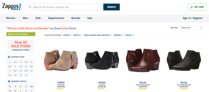
Not many colors. Maybe not even five?
Blue, Black, Orange, Yellow and Green?
That’s about it for the main colors. Nothing is too distracting.
9. Instructions
People like instructions. You don’t necessarily need to say “Step 1, Step 2…”, but giving people directions on what to do next will improve your conversion rates.
Leading people through the sales process just like in person. Taking them from step to step until the final call to action.
For a website designer it might be something like the intro to what you do, then your portfolio, then your pricing and packages and finally the offer to have a discovery discussion.
10. Links (That Looks Like Links)
Check back to that Zappos screenshot.
The links they want you to click most, the product links, are basic underlined blue links. Just like we all saw first on the Internet and we’re still conditioned to those today.
Make your links look like links.
Over the years people have gotten used to images being links too so just about all your images should link to something.
Conclusion
A little attention to your website every few months can go a long way. Think of it as spring cleaning, but doing it about every 3-6 months.
Go through the site and clean things up. Make it less complicated and not more complicated. You can add things, but only if you’re taking other things away.