The design of your business blog is important.
I’ve seen enough blog designs to know that if design is overlooked it can have a negative impact on the blog.
The blog could have amazing content, but if people come to the site and don’t trust it they’ll leave immediately. If the design doesn’t turn them off immediately they can still be deterred if the design is clumsy and frustrating. I’ve seen it happen with spacing issues or weird looking elements on the page.
We’ve written about blog design previously. Check out that post for some of the key elements of blog design.
Before we get into 10 great business blog designs let’s first look at the three options you have for blog design.
1. Free Template
We recommend using WordPress to start your business blog. You can use a free template and make a few customizations to it. We’ve actually used the basic WordPress template before while having a designer create a couple custom images for it. This costs $0 for the template and a couple hundred at most for the images.
2. Paid Template
There are many paid templates to use with WordPress too. They can run from about $20 to $200 or so. These are designed by top notch designers. Some templates are for specific types of blogs or specific industries. They make it easy for a person that is new to blogging to use, but do limit the amount of custom work you can do. If you want a lot done you’ll have to hire a designer and developer to make changes and if you do that you might as well go for a fully custom site.
3. Custom Design
This can run up into the thousands, but if you want a design that fits your brand well and accomplishes your goal of earning readers and getting them into your sales funnel than this is the way to go.
Alright, now let’s get into some of the best business blog designs out there.
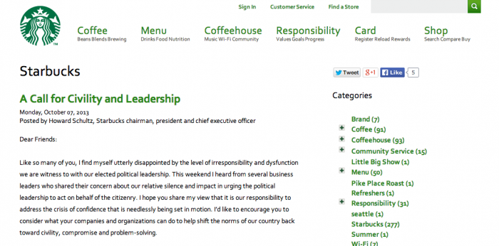
1. Starbucks Blog
Coffee lovers rejoice!
Starbucks has a great blog and a great design to match. It’s simple in design. The branding is there. The white space use is perfect. There is nothing to distract and confuse you on the page. I like a blog that has a color for the call to action. One look at this blog and you know that green means action. That’s easy for people to understand. No confusion here.
Plus the blog is responsive, which is huge today because so many people are visiting sites and reading blogs on their smartphones.
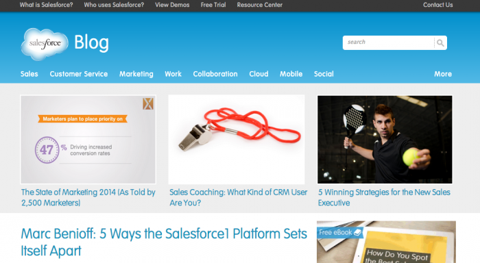
2. Salesforce Blog
Salesforce is one of the biggest online companies ever. They’re huge in the B2B world. Just about every company with a sales department uses Salesforce.
The company also has a great blog with great information for their target readers.
And they have a great design to go along with it.
There are subtle things about this blog that I love. First, when you hover over links or actions the item turns orange. This is great for getting people to click where you want them to click.
There is also a small link at the top – “What is salesforce?”. This is great for keeping new visitors that come to blog posts on your site and moving through the early stages of the sales funnel.
Finally, I love the call to action for the ebook in the sidebar. It’s simple and not intrusive, but it stands out enough so that people consider signing up before leaving the site after reading a post.
3. TurboTax Blog
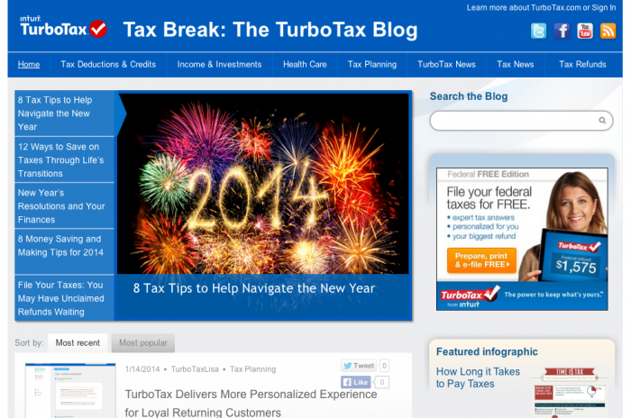
At first look you wouldn’t think the TurboTax blog is anything special.
But upon closer examination I think it’s a great business blog design. The focus is on the content. When you look at an individual post you can see that TurboTax used some restraint with their calls to action. They could have went all out with CTAs for their software, but they didn’t. The CTAs do exist, but nothing too much.
I also like the search the blog search bar area at the top right. That’s a good way to keep people on the site looking for the exact information they seek.
4. Carbonite Blog
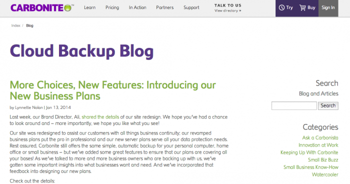
The Carbonite blog reminds me a little of the Starbucks blog in its design.
The design is very simple, which I like. That puts the focus on the content. The navigation at the top is there when people want to move in to discover more about Carbonite, but it’s not in the reader’s face.
When you visit the blog through a post you’re going to be able to read it without being distracted. And if the post is good you’ll easily find your way to more content with all the links in the sidebar for categories and tags.
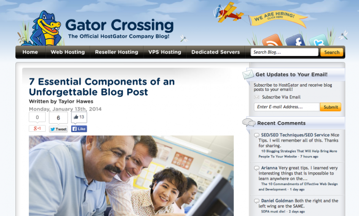
5. Gator Crossing by HostGator
This blog has been getting better and better.
Not only do they share great content all the time for anyone looking at online hosting, but the design is really good.
You might not think this design is all that flashy, but that brings up a good point. When designing a website or a blog you don’t want to make it seem like it’s something you’re not.
If you’re a regular blog attracting regular people then go for that look. You don’t have to be a runway model to attract your audience.
I think HostGator does a good job at attracting their audience. I was attracted to it so maybe I’m in their target group.
A couple things to notice.
First, the email signup at the top right. That’s key for building your blog following.
Second, the subtle way the main navigation is used at the top. It’s there, but not in a distracting way. But new readers can easily find their way to HostGator’s main pages.
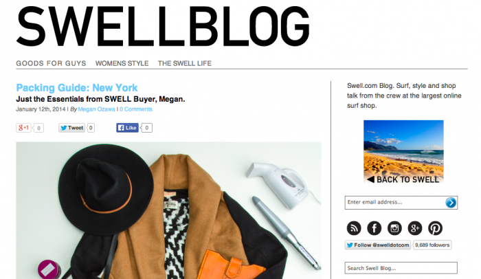
6. Swell Blog
The Swell Blog has a cool name, but I guess that’s because the brand has a cool name.
The blog is very minimal in design, which by now you know I like. It’s my style, but I think it serves a purpose. When you have a minimal blog you’re not going to confuse your visitors. They can focus on the content and find their way around from there.
This blog makes it easy to read the posts and if you’re interested in going to the main Swell website you can easily find the image and link at the top right of the sidebar.
7. Coca-Cola
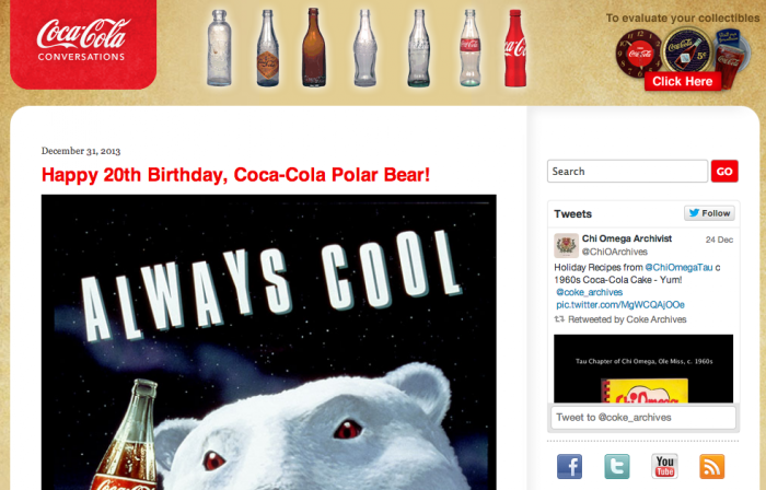
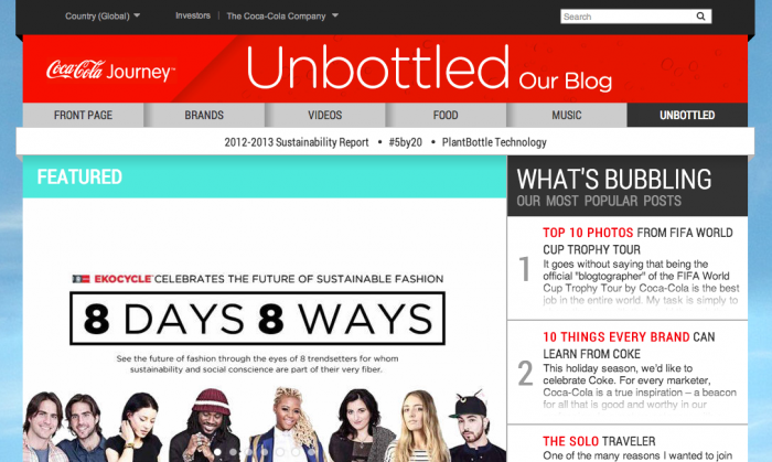
Coca-Cola has a couple blogs and both have good design.
The Coca-Cola Conversations blog has a really neat background. These background images are becoming more popular especially on news sites. Those sites use these backgrounds for advertising, but for business blogs the background presents a different opportunity. You can use great designs to show off your brand’s style.
The Coca-Cola Unbottled blog is more modern looking. There is a lot going on, but it kind of works. There is a lot of information and when you’re reading the posts there is no doubt that you’re on a Coca-Cola branded website.
8. Comcast Voices
The Comcast Blog is a little different.
Again, I like the simple way it’s incorporated into the main site. There is a simple link back to the corporate site so the focus is on the blog and its content.
What you’ll notice about this blog is that the images are put front and center on the main blog page and in the posts. Blog readers like to see images and Comcast does a good job of using images throughout its blog.
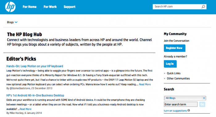
9. The HP Blog
You’ve probably noticed a trend in the way I rate these blogs. I like when business blogs are simple in design. When you get too many elements on a page you’re going to risk distracting and confusing your readers.
With online business you want to keep people focused and when it comes to blogging that means keeping them focused on the content.
The HP Blog is a good example of simple design that allows for focus on the content. It’s all about the blog except for the three basic and unobtrusive links in the top navigation.
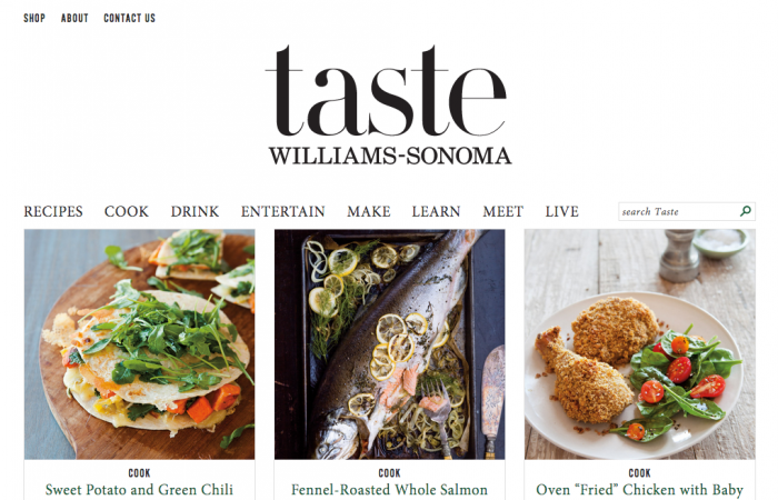
10. Taste by Williams-Sonoma
The Williams-Sonoma blog design is really cool.
So many ecommerce companies and retailers put their blog kind of on the inside of their regular ecommerce site. You’ll see the normal navigation for the ecommerce website and it gets kind of distracting. There are just too many things happening on an ecommerce site for it to work with a blog.
That’s why I like what Williams-Sonoma did with this blog.
Great use of white space. The sidebar has the information you want, but it doesn’t draw attention away from the post, which is important.
And there you have it!
These are some of the best blog designs from all over the web. Hopefully you can pull some inspiration from them for your own business blog design.

